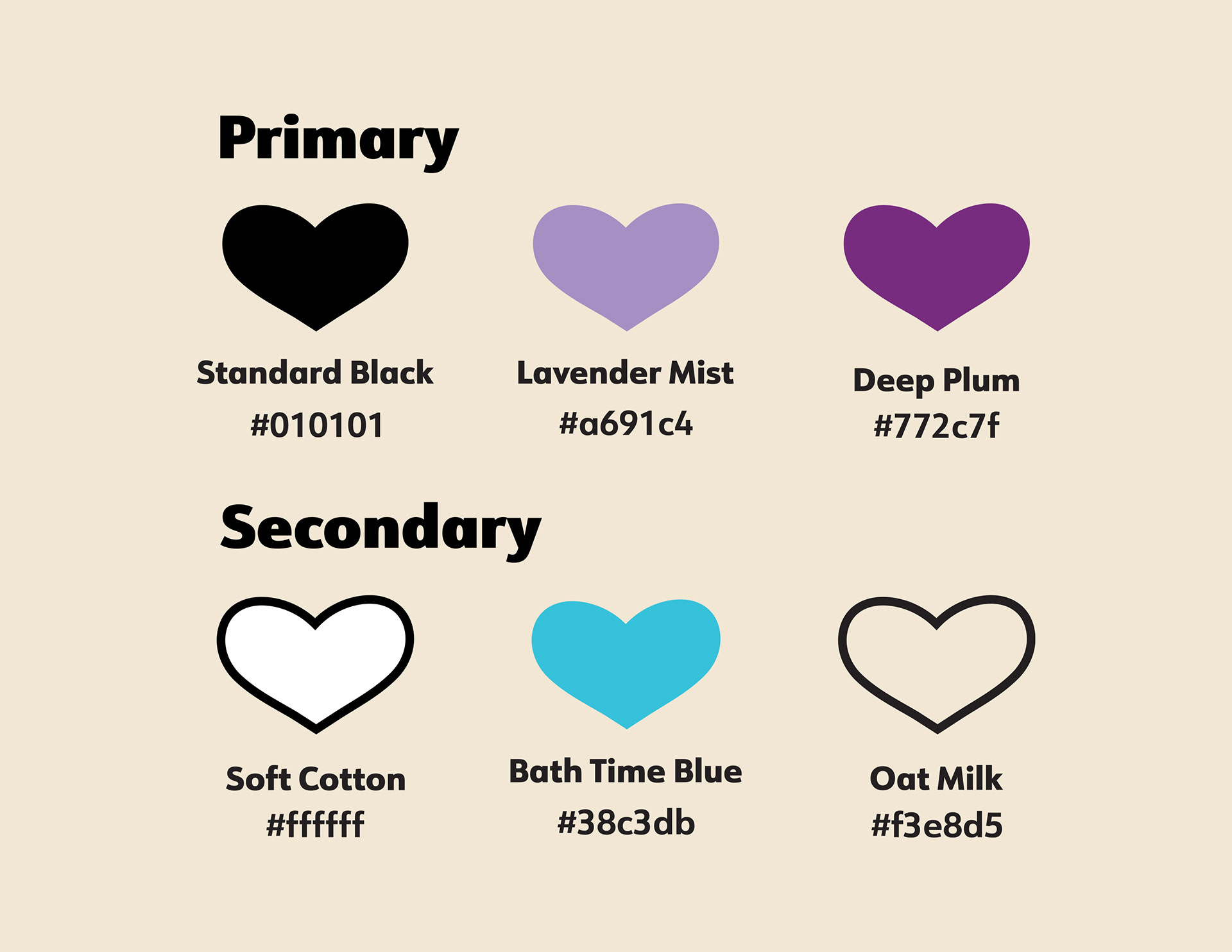
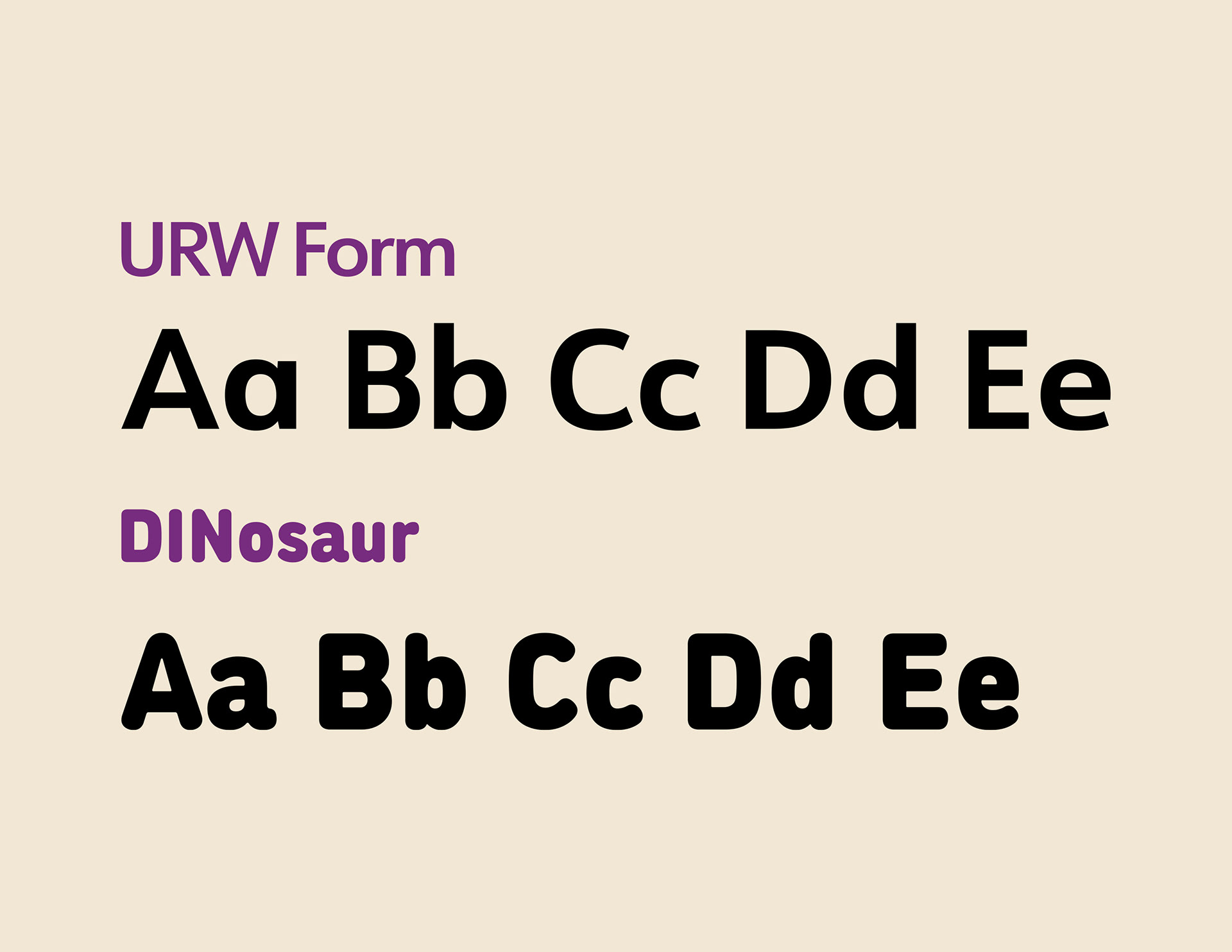
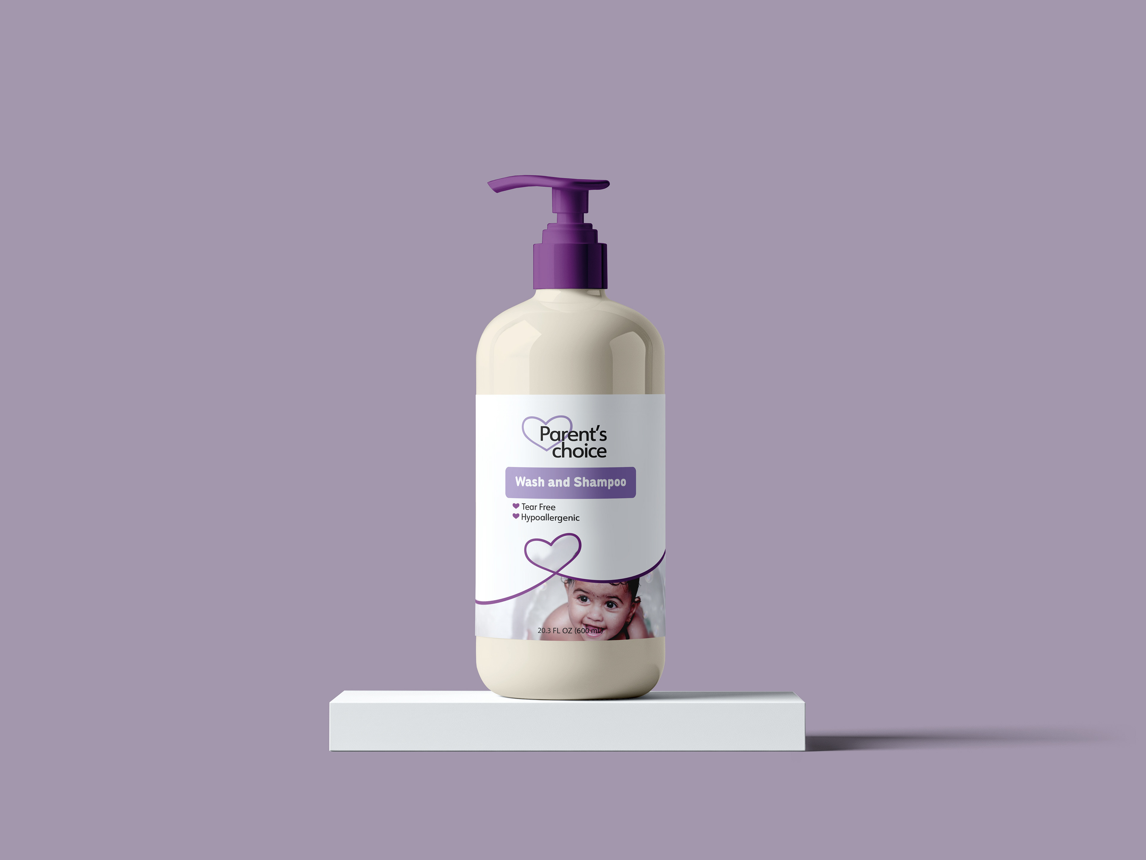
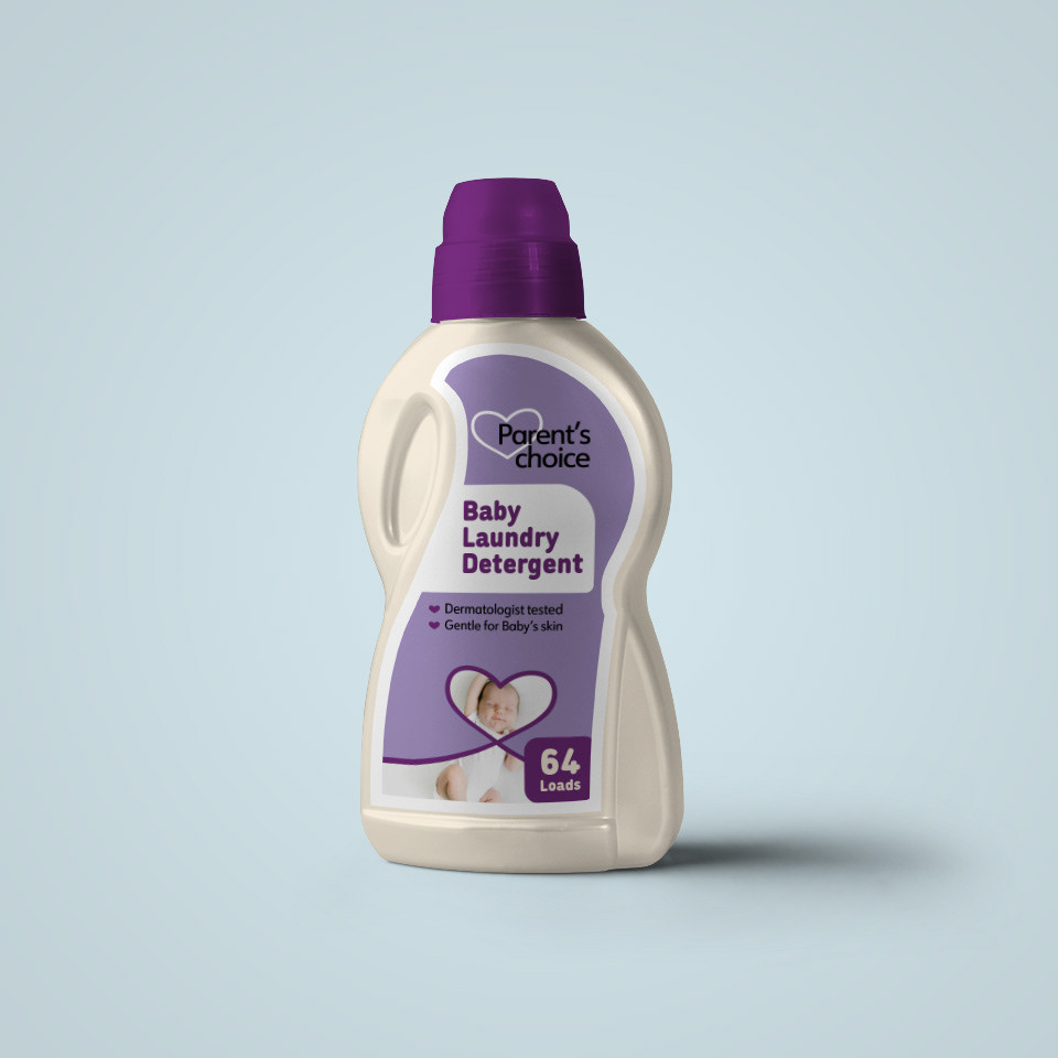
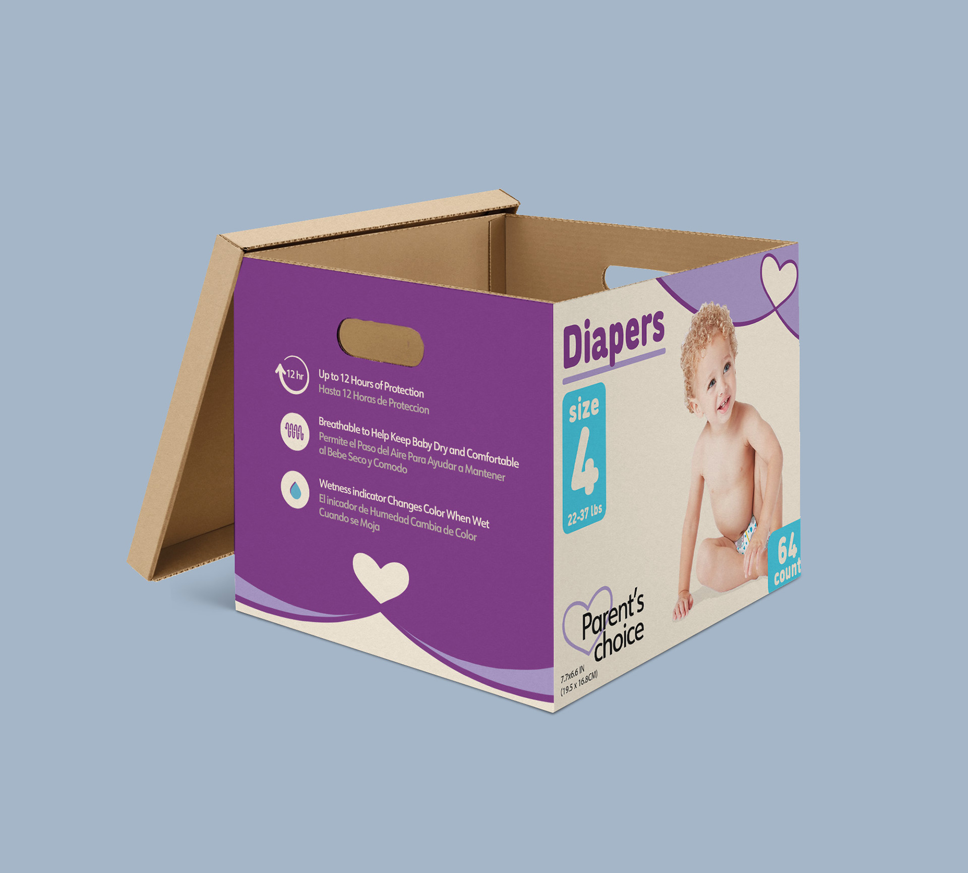
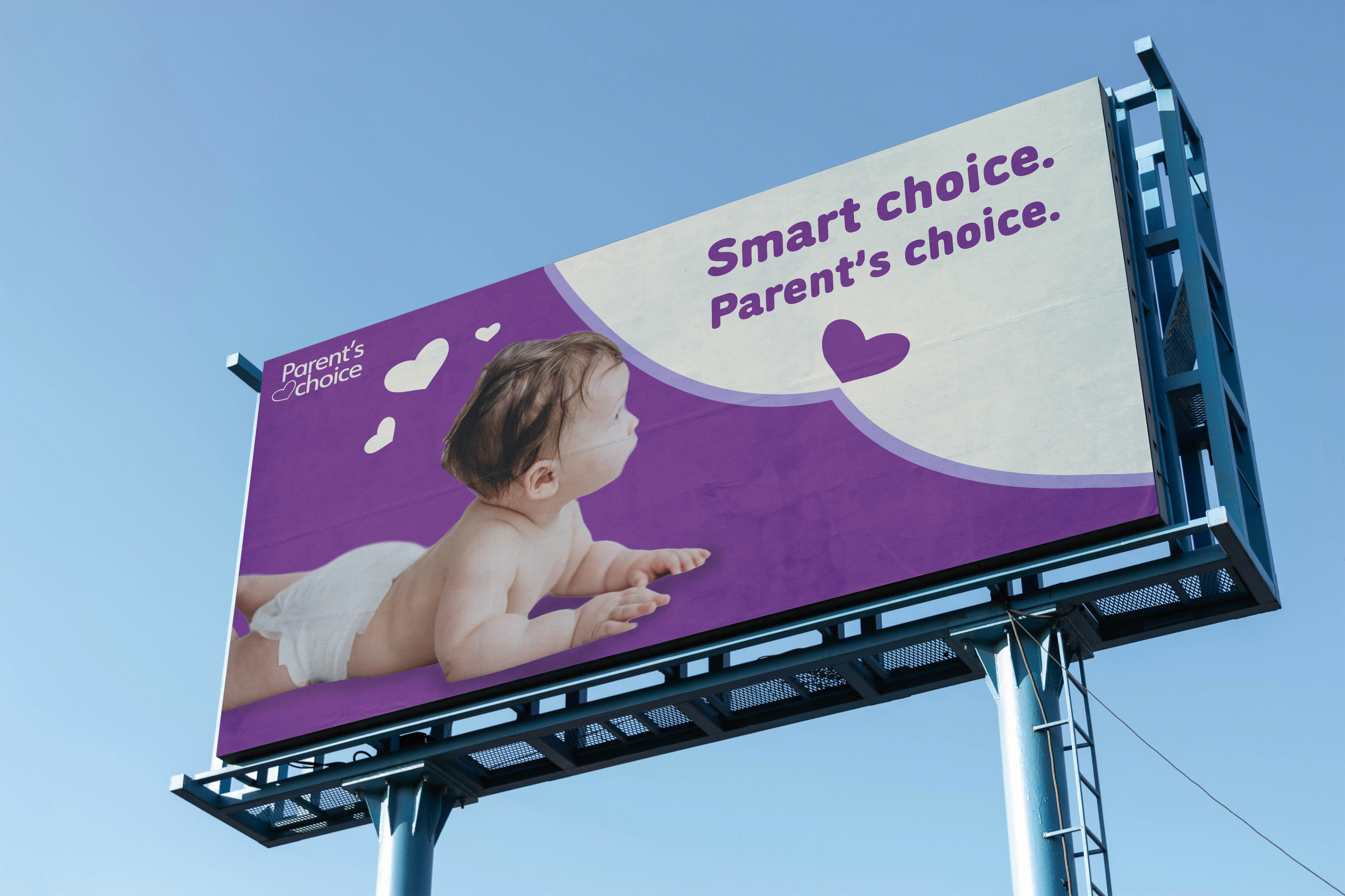
In this project I decided to do a redesign for Parent’s Choice. It is known for being affordable, but its packaging doesn’t always build trust. This rebrand focuses on helping parents feel at ease choosing it, especially for everyday hygiene products. A calm, minimal design paired with a simple hand-drawn heart creates a balance of clarity and care making the brand feel more reassuring, while still staying accessible.
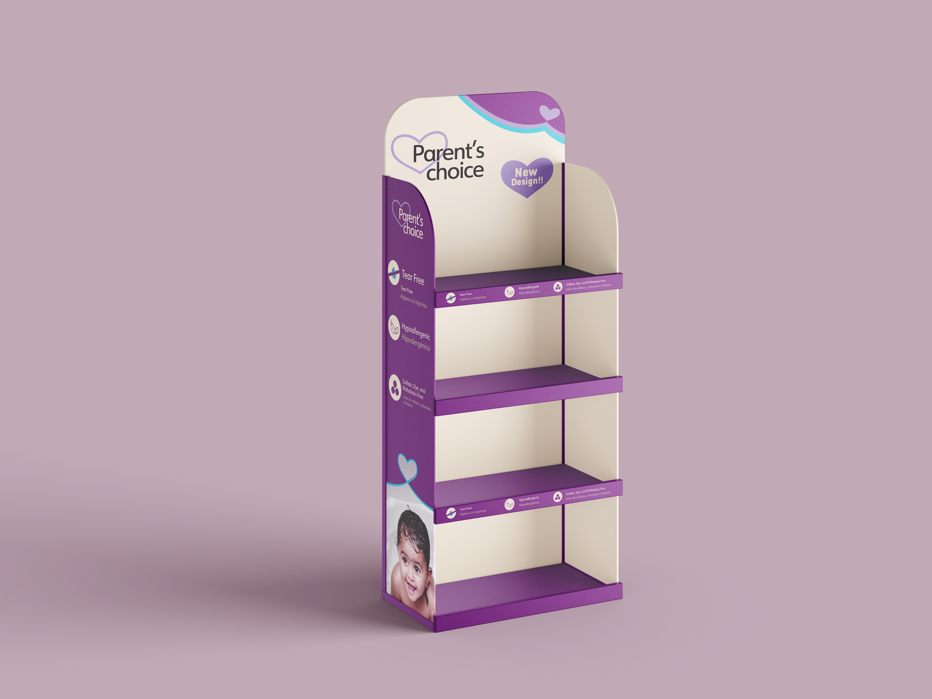
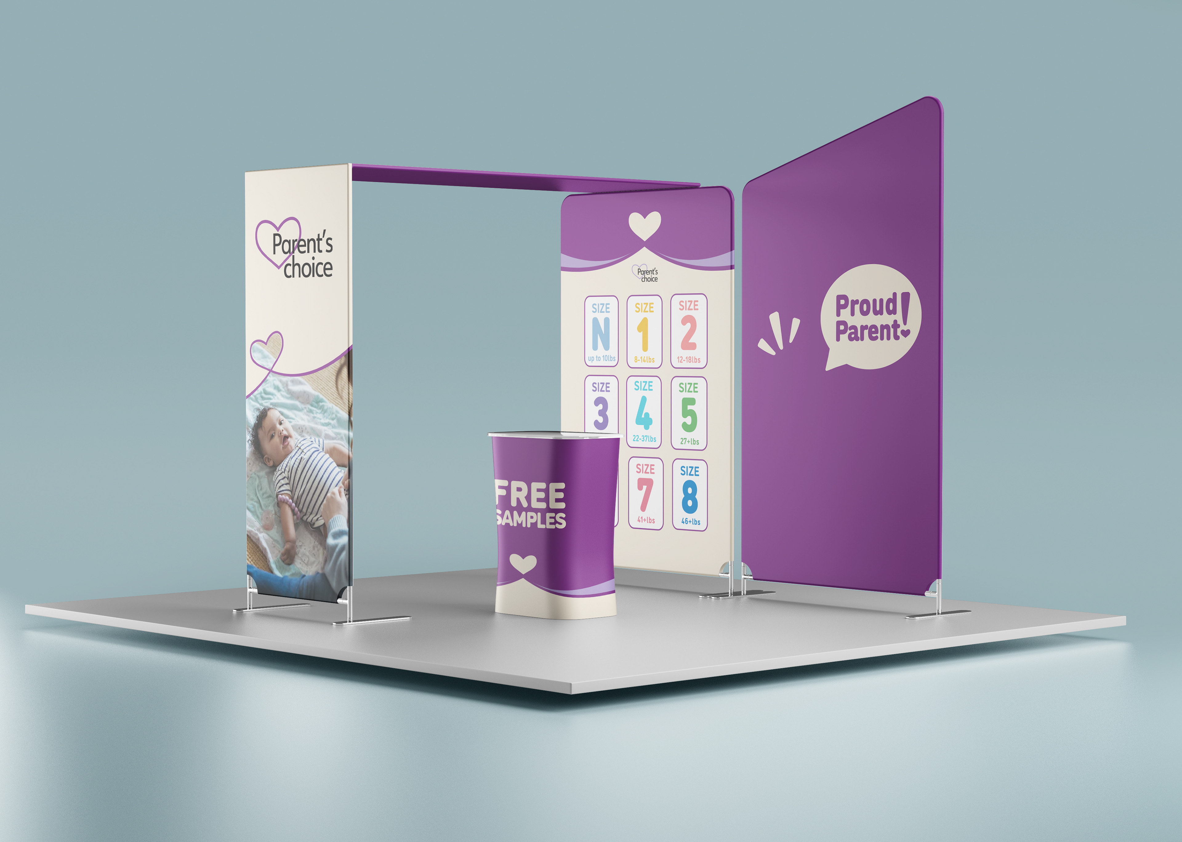
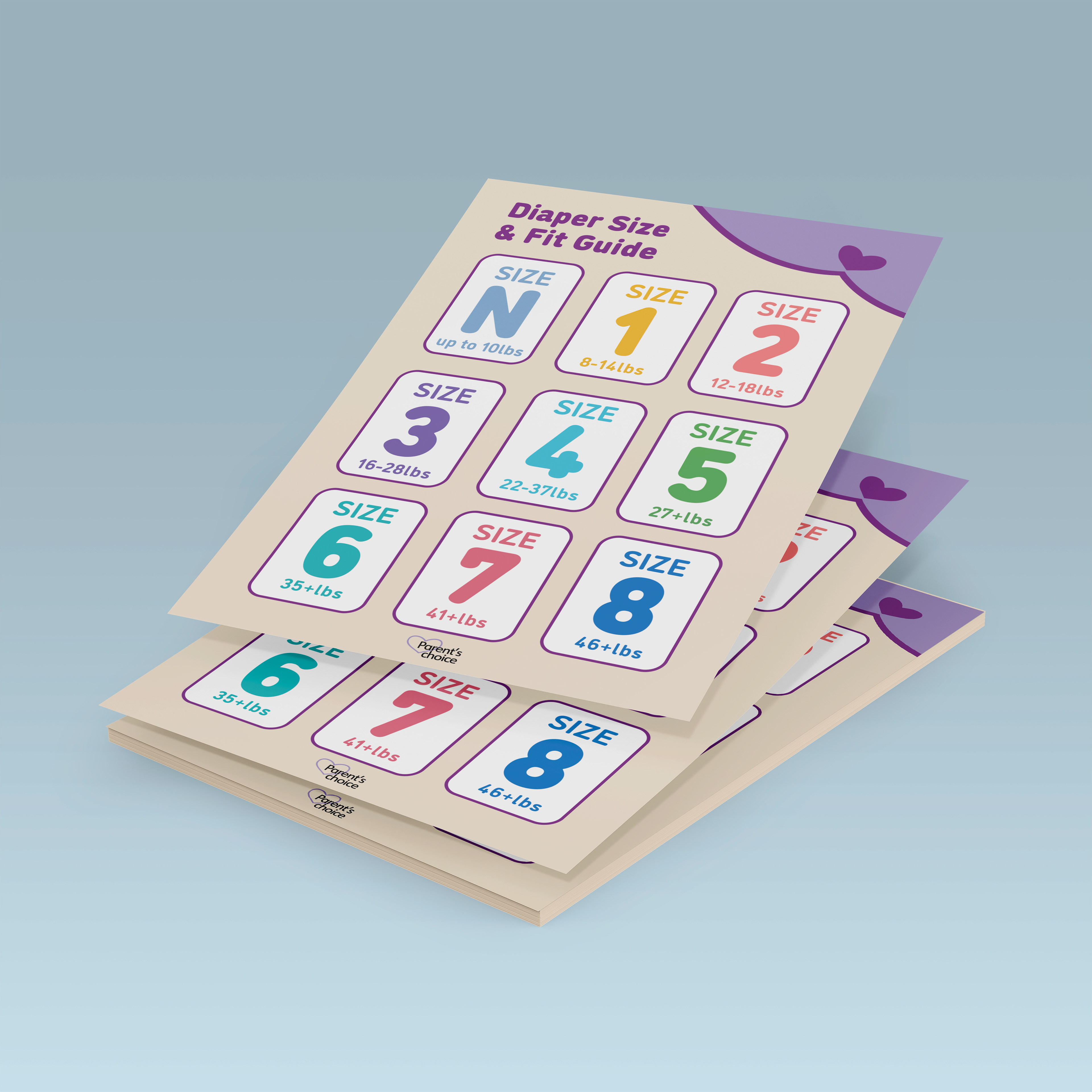
The pop-up exhibit engages parents through an immersive brand experience, while the accompanying diaper size guide poster reinforces clarity and usability by presenting essential product information in a simple, easy-to-understand format.